Designed to address identified experience gaps and boost conversion through increased exploration
Pepsi Product Page Redesign
Design, delivered and in development queue for phased & tested rollout
It all starts with a hypothesis.
This project defined a future-state PDP design direction for Pepsi focused on improving clarity, scan-ability, and providing wider variety of decisions while preserving Pepsi’s bold visual identity.
Through heuristic evaluation, PDP performance analysis, and cross-industry UX benchmarks, we identified several gaps within Pepsi’s existing product detail pages.
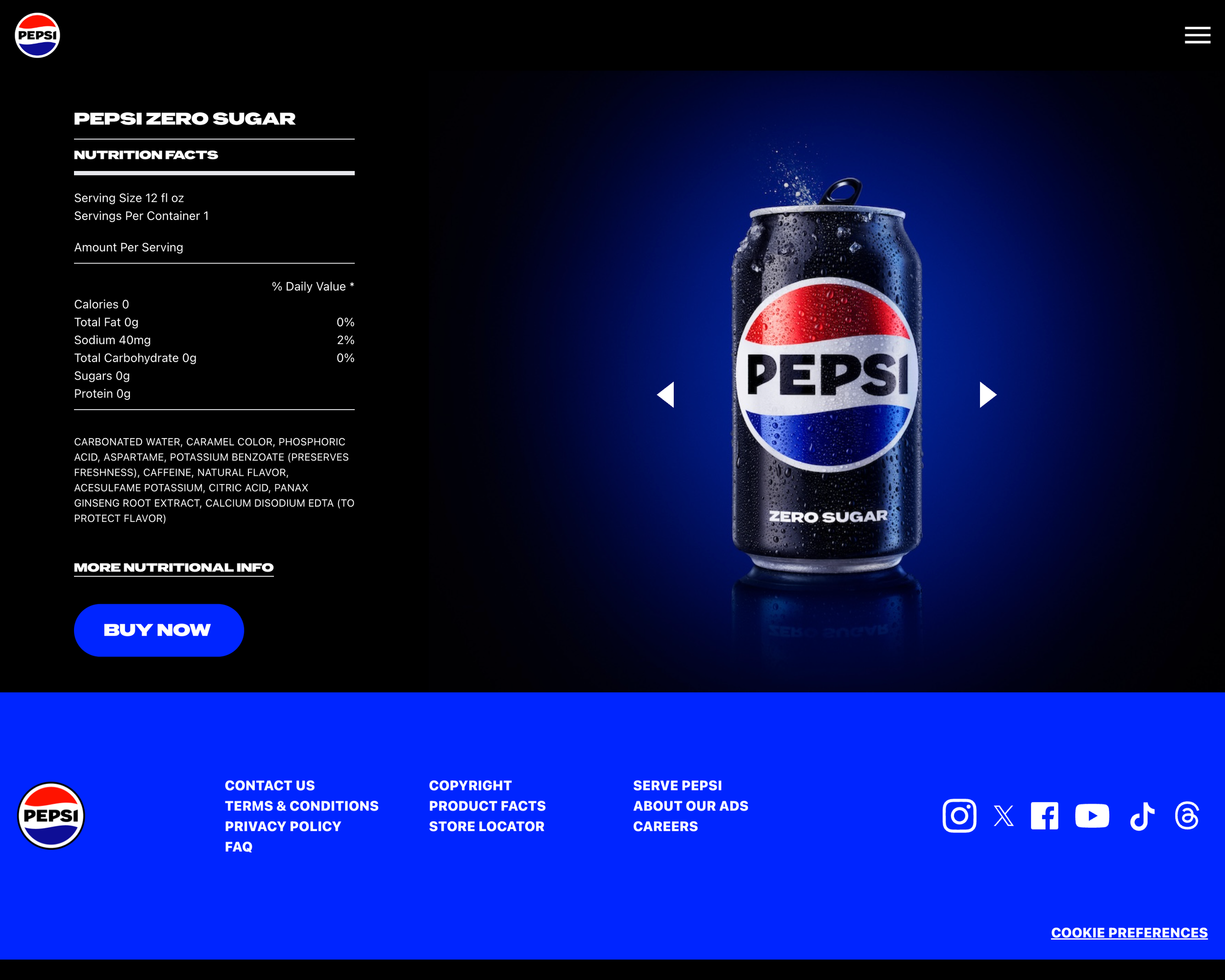
The original PDP was visually striking, but functioned more like a static brand moment than a educational and exploratory surface. For users purchase paths were vague and required multiple users actions. For Pepsi our goal was have dedicated content sections for SEO rankings, captivating brand moments, reasons to choose Pepsi and clear calls to action for users to, shop, sign up and explore the Pepsi soda offering.
With those insights, I redesigned the Pepsi PDP to better support clarity and progression, while staying aligned to Pepsi’s bold visual language.
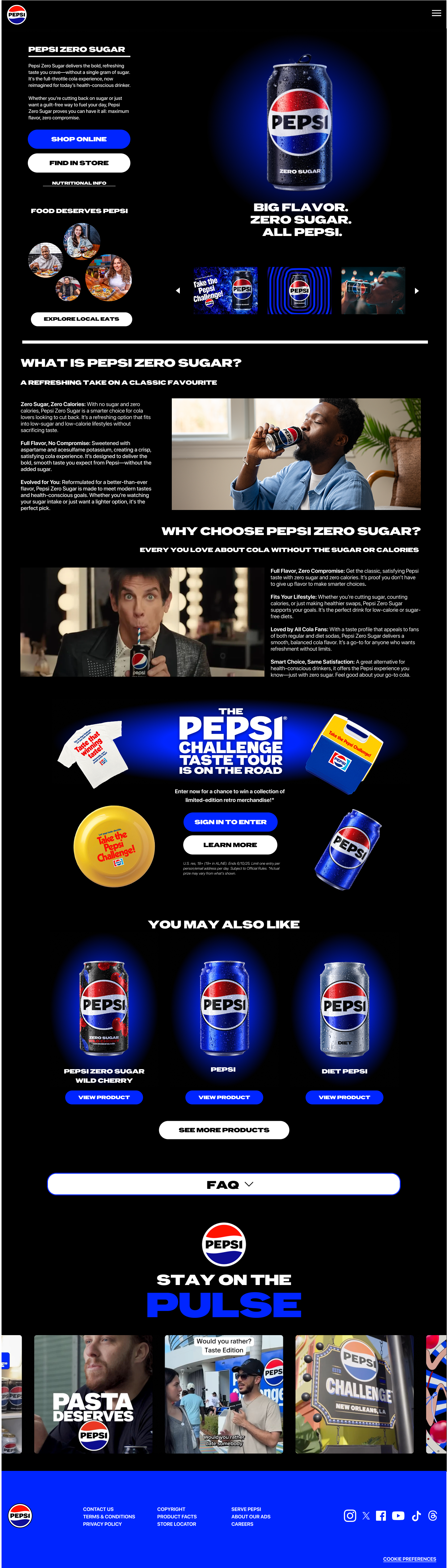
The updated experience introduces a clear hierarchy from the moment users land on the page. Product identity and value are immediately established, followed by explicit next actions such as shopping online or finding the product in store. Informational content is organized into scannable sections that answer the questions users naturally ask as they move from interest to intent what it is, why it’s different, and how it fits into their lifestyle.
Rather than treating the PDP as a single hero moment, the redesign reframes it as a guided product journey. Brand storytelling, lifestyle content, and related products are layered intentionally to reinforce decision-making instead of competing with it. The layout was designed modularly to support future campaigns, SKUs, and content updates without reworking the core structure.
The result is a PDP design direction that shifts the experience from brand-first to decision-led, helping users move confidently from curiosity to action while maintaining Pepsi’s iconic presence.
This project reinforced a simple truth: strong brands don’t lose impact when structure is added, they gain momentum. By introducing clarity and hierarchy, the PDP becomes not just a showcase, but a functional product experience designed to perform.
Before
After
Tools Used