
Designing Experiences for a senior audience
Consumer Cellular
We saw a +7.56% increase in Confirmed Purchases with 98% statistical significance.
It all starts with a hypothesis.
Consumer Cellular serves millions of senior customers across the U.S. — but their homepage wasn’t doing the same level of service. I stepped in to redesign it with a focus on clarity, trust, and conversions.
Through analytics deep dives and various qualitative research, we discovered top user concerns such as:
The homepage CTA “Shop Plans” felt vague and untrustworthy to first-time visitors.
Visual clutter overwhelmed users, especially on mobile, for older demographics.
Trust elements like “Free of Contracts” were vague and didn’t connect to user interest amongst promotions.
“Free of Risk” language generated skepticism rather than trust amongst users.
Users weren’t immediately aware of Consumer Cellular’s core offering
With that and a lot more data, I redesigned the Consumer Cellular Home Page with the approach of:
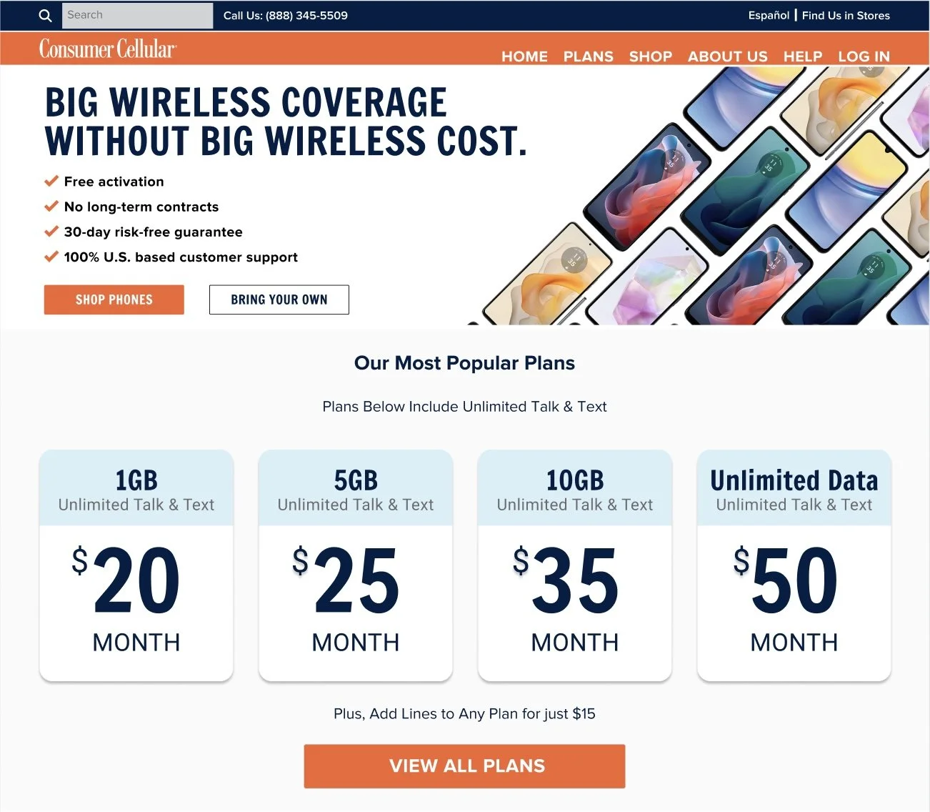
Surfaced plan pricing above the fold to immediately communicate value
Replaced promotional blocks with a simplified trust-first layout
Consolidated scattered features into a single benefit-focused bullet list
Rewrote microcopy across the page to sound clear, calm, and human
Created a responsive hierarchy that performed equally well on mobile
With the collaboration of great developers, we translated a Figma Prototype to a functional web page using JavaScript and CSS and testing using Adobe Target and deep analysis with Adobe Analytics Integrations.
In the end
This project was a reminder that clarity always wins. By decluttering the layout and leading with trust, we turned a generic telco homepage into a focused sales tool — without adding a single pop-up, modal, or “limited time offer.” Just solid UX and strategy.
Before

After
Tools Used
